
If the user gets confused when opening the website, understand the problem. A user-friendly website is one where every visitor understands everything quickly. If a site is slow or the design looks outdated, people don’t stay there. According to statistics, 88% of people do not return to a site that bothers them the first time. The first impression of a website is an indication of its ineffectiveness. They will not be there when the user has to discover the location of the contact form, or where the visit button stating buy now is hidden.
The one-click navigation, simple design, and quick loading is a mandatory thing in the digital world. You must be able to know how the user thinks. If the user has to try to click, he will leave the site. And such bounce rate is dangerous for business.
A User-Friendly Website has Fast loading speed

Google research states that 53% of people leave a site if it takes more than 3 seconds to load. Now imagine how much your site would suffer if it took 6 seconds. Loading speed also affects SEO. Google will demote a site when it realizes that people are departing a site at a fast rate. It is necessary to compress the size of pictures, install caching and clean code. The faster the site, the more trusted it is.
A slow website not only spoils the mood of users, but it also seems unreliable. If you’re using an app, the speed of backend APIs also matters. Hosting should also be fast. If the site is running on shared hosting, sometimes it goes down which disrupts the traffic. That’s why using SSD hosting and CDN is recommended. Speed is the first step to consumer confidence.
Make the website mobile friendly
More than 60% of traffic today comes from mobile. If your website doesn’t display well on mobile, you’re already missing half of your audience. Mobile responsive website design means that the layout should be perfect on every screen. Text should be easy to read, buttons should be easy to click, and scrolling should be smooth. Google also does mobile-first indexing. This means your mobile version gets the first ranking as a base.
The thinking is that if a user zooms in to read the text, that user won’t come back. Responsive design uses a grid system that auto-adjusts. The use of media queries is common in CSS. Nowadays frameworks like Bootstrap and Tailwind make this task easy. Each new configuration should be tested on real devices. Testing on an emulator alone is not enough.
Clear the navigation bar
A user going to a webpage must know where one is at first glance. It is the navigation bar which the user interacts with first. If the menu is confusing or there are too many options in the dropdown, the user gets distracted. Best practice is to have 5-7 links. Home, About, Services, Blog and Contact. A very complex structure creates difficulties for the user. The name of each link should be simple and short. If the menu bar is fixed, the user can easily access it at any time.
Breadcrumbs are also helpful in showing the user what part of the site they are in. The color contrast of the navigation bar should be clear so that the user can easily read it. Using icons also improves user flow. Each page title should be meaningful which also helps in SEO.
Add Calls to actions that actually work

CTA’s are call to action buttons that guide the user to the next step. “Buy now”, “Get a quote”, “Subscribe today”,these are all common CTAs. However, they are successful only in case the placement is ideal. The click-through rate reduces when the button is concealed or done in a dull color. Its CTAs must be in bold color with straightforward words. The call to action should also be above the fold thus the user should not need to scroll up to find the call to action.
One secret to increasing conversion rates is to have just one objective on each page. Too many CTAs on a page creates confusion. CTAs also need to be tested , through A/B testing you can find out which design is performing best. Short and powerful text performs better and makes a user-friendly website. Like “Start Now” or “Claim Offer”.
Keep Visual design that engages
A user-friendly website design doesn’t just have to be colorful, it should support functionality. Each element has a purpose. Using white space improves readability. There should be adequate margins and padding between each section. Typography should be readable, font size should be suitable for both mobile and desktop. The logo should be clearly visible and the branding should be consistent.
Minimal design is trending these days, which means minimal distractions and maximum focus. Color contrast is also important for accessibility. Each image should be optimized so that speed is not affected. Using icons makes the site look clean and professional. Animation and micro-interactions engage the user, but overuse creates confusion. Every design element should have a purpose: either to guide, or to educate, or to persuade.
Access for all
An accessible and user-friendly website is the one that will be open to the disabled. The digital inclusion is overdue. You need to ensure support for screen readers. Alt text should be written for images. Font size should be zoomable and color contrast should be readable. Keyboard navigation must be supported. Everything should be functional even if someone is only accessing the site using a keyboard. Error messages in the form should be clear and understandable.
Buttons should have hover effects and focus indicators to assist visually impaired users. Following the Web Content Accessibility Guidelines (WCAG) has become a fundamental standard for web development today. Such websites are not only comprehensive but also ensure legal compliance, especially in the US and Europe.
Take care of Feedback to make User-Friendly Website
If a user encounters a problem and doesn’t find a way to provide feedback, they won’t return to the website. Every user’s feedback is important , whether it’s a bug report or a suggestion. Contact form should be short and clear. Email and social media links should be readily available. The live chat feature increases engagement and builds trust.
Users spend more time on sites that provide real-time responses. Frequently asked questions and help sections provide quick answers to basic questions. If feedback is received, an automated response should be made. Save spam to feedback forms by using captcha. Ruling customer opinions and making decisions based on this enhances brand image. Such responses are part of customer satisfaction.
Easy SEO integration
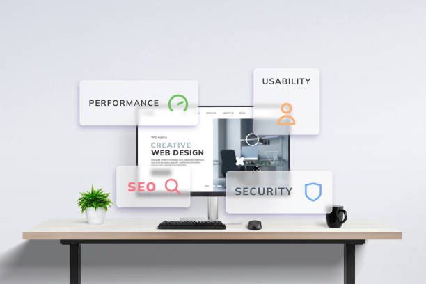
A user-friendly website and SEO optimized website both go hand in hand. If a user likes a site but can’t find it on Google, it’s no use. All titles of the pages, meta descriptions and URLs must be definite and keyword oriented. The structure (H1, H2, H3) of heading should be obvious. Images must have ALT tags. An internal linking structure guides the user to relevant content.
A sitemap and robots.txt file help search engines crawl. Mobile speed and a site’s SSL certification are ranking factors in SEO. If the bounce rate is high, Google lowers the ranking. Each page should have unique and original content. Duplicate content is penalized on the site. Organized information Google can interpret the layout of your content using structured data (schema markup). Technical On-page and off-page shall maintain a balance of focusing on SEO.
Conclusion
After all, user-friendly means simplicity, speed and understanding. A website that works flawlessly on every device, where content is clean, navigation is easy and the trust factor is high. A website is truly user-friendly when a user seamlessly achieves their goal, whether it’s signing up, buying a product, or just reading a blog, then that’s it. Every element, from CTA buttons to mobile responsiveness, plays a role.
And this improvement is not in vain. With every update comes new tools and new expectations. That’s why regular testing, feedback and updates keep the site relevant and effective. Today’s digital consumer is smart, they expect not only design, but also speed and value. A website that provides all this is not only successful but also sustainable.